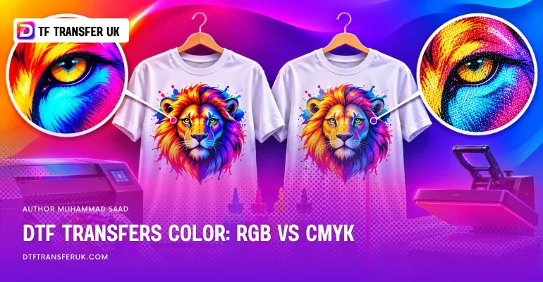
DTF transfer colors are produced using printing inks that create designs on transfer film before they are applied to fabric.
A DTF color chart helps identify how different shades appear after printing and heat pressing. RGB represents colors displayed on digital screens, while CMYK represents the ink colors used in DTF printing.
The difference matters because some bright RGB colors cannot be reproduced exactly with CMYK inks. For our printing workflow, artwork should be supplied in CMYK because RGB files are automatically converted, which can affect the final shades.
Using suitable color profiles, printed swatches, and test transfers helps achieve more accurate color matching.
What Is a DTF Transfer Color?
DTF transfer color is the printed color of a design created with specialized inks on transfer film and then applied to fabric using heat and pressure. DTF printing uses cyan, magenta, yellow, and black inks to produce different shades, along with white ink that provides an opaque backing for the design.
The white underbase helps maintain color visibility on dark garments, while the CMYK ink combinations determine the printed shades. A design may contain solid colors, gradients, fine details, and photographic tones, making DTF printing suitable for logos, custom clothing, and detailed artwork.
The final color appearance depends on the artwork's color values, printer color profile, ink formulation, white ink coverage, and fabric. These factors explain why a color displayed on a monitor may look different after the transfer has been pressed onto a garment.
What Is a DTF Transfer Colors Chart?
A DTF transfer colors chart is a printed reference containing multiple color swatches and their corresponding color values. It helps designers compare digital color selections with actual printed results before preparing artwork for production.
For reliable color selection, use a physical DTF color chart produced with the same printer, inks, and color profile as the final order. Press the chart onto the intended fabric and compare its swatches under consistent lighting.
In a CMYK chart, each swatch is identified by four percentages representing cyan, magenta, yellow, and black ink values. The following chart illustrates common CMYK ink combinations used as starting references.
Color | Cyan | Magenta | Yellow | Black |
|---|---|---|---|---|
Cyan | 100% | 0% | 0% | 0% |
Magenta | 0% | 100% | 0% | 0% |
Yellow | 0% | 0% | 100% | 0% |
Red mixture | 0% | 100% | 100% | 0% |
Green mixture | 100% | 0% | 100% | 0% |
Blue and violet mixture | 100% | 100% | 0% | 0% |
Black | 0% | 0% | 0% | 100% |
What Is DTF Transfers RGB Color?
RGB color in DTF transfers refers to the red, green, and blue color values used to create and display digital artwork before printing. RGB is an additive color model in which different intensities of light combine to produce colors on monitors, smartphones, and other digital screens.
Each RGB channel typically uses values from 0 to 255. For example, RGB (255, 0, 0) represents bright red, while RGB (0, 255, 0) represents an intense green.
RGB can represent highly saturated colors that may fall outside the printable range of standard CMYK inks. This range is known as the color gamut.
When RGB artwork enters a DTF printing workflow, the raster image processor (RIP) interprets its color values and converts them into the ink combinations the printer can reproduce. As a result, a vivid green or electric blue visible on a screen may appear less saturated on the finished transfer.
RGB is therefore useful for creating and viewing digital designs, but its appearance on a screen does not guarantee the same appearance in print.
What Is DTF Transfers CMYK Color?
CMYK color in DTF transfers is a subtractive color model that uses cyan, magenta, yellow, and key (black) inks to reproduce artwork on transfer film. Unlike RGB, which creates colors through emitted light, CMYK produces colors through inks that absorb and reflect light.
Each CMYK channel is expressed as a percentage from 0% to 100%. Different percentages create different hues, tones, and levels of darkness.
For example, a basic red mixture can use 0% cyan, 100% magenta, 100% yellow, and 0% black. The exact printed red depends on the printer, ink formulation, and color profile.
In DTF printing, CMYK inks work alongside white ink. The white underbase provides opacity and helps preserve the appearance of printed colors when transfers are applied to dark textiles.
CMYK artwork prepared for a specific printing workflow also allows designers to evaluate color separation and printable color limitations before production. An appropriate ICC profile helps translate the intended colors into values suitable for the printing conditions.
What Is the Difference Between DTF Transfer RGB & CMYK Colors?
The main difference between RGB and CMYK colors in DTF printing is how they create and reproduce color. RGB uses red, green, and blue light to display digital designs, while CMYK uses cyan, magenta, yellow, and black inks to print those designs onto transfer film. RGB generally supports a wider range of bright screen colors, whereas CMYK is limited by the printable gamut of the ink system. This difference can cause certain shades to change during conversion, particularly highly saturated blues, greens, and oranges.
Feature | RGB Colors | CMYK Colors |
|---|---|---|
Full form | Red, Green, Blue | Cyan, Magenta, Yellow, Key (Black) |
Color model | Additive | Subtractive |
Color production | Combines emitted light | Combines printing inks |
Primary use | Digital artwork and screen displays | Physical printing |
Values | Typically 0 to 255 per channel | 0% to 100% per channel |
Color gamut | Can represent highly saturated screen colors | Limited to colors the ink system can reproduce |
Bright colors | Can display intense greens, blues, and other vivid shades | Some intense shades require adjustment |
DTF printing role | Represents the original digital artwork | Represents the process ink channels |
Color conversion | Requires conversion for our CMYK printing workflow | Used in the required artwork preparation workflow |
Final appearance | Depends on display calibration and color profile | Depends on inks, printer profile, white underbase, and garment |
RGB and CMYK values are not directly interchangeable. A numeric RGB value does not correspond to one universal CMYK mixture because color conversion depends on the source and destination color profiles.
A properly managed conversion helps preserve the visual appearance of the original design as closely as the printer's available color gamut allows.
Why Must Your Artwork Be in CMYK?
Your artwork must be supplied in CMYK for our specified printing workflow because our production setup uses CMYK process inks and requires artwork prepared for that color system.
If you submit an RGB design, our printing software automatically converts its colors into CMYK values before production. During this conversion, certain colors may change because the printer cannot reproduce every shade available in RGB.
For example, a bright green logo created in RGB may become less saturated after conversion. If the change occurs automatically during printing, you may not have an opportunity to review the adjusted shade before the transfer is produced.
Preparing your artwork in CMYK allows you to inspect the converted colors, adjust important shades, and review the design before submission.
Use the appropriate CMYK color profile for our production process rather than selecting an unrelated generic profile. Simply changing a document from RGB to CMYK does not guarantee an exact match because the conversion settings and printer's printable gamut still determine the result.
For our specified workflow, submit artwork in CMYK rather than RGB to reduce unexpected color changes during automatic conversion.
How to Match DTF Color for Best Printing?
Matching DTF colors for the best printing results requires accurate artwork preparation, suitable color management, and comparison with physical printed samples. The most dependable approach is to evaluate the design under conditions that closely represent the actual production process.
1. Use the correct CMYK color profile
Prepare your artwork using the CMYK profile specified for the printing workflow. An ICC profile defines how numerical color values relate to visible colors and helps software manage conversion between different devices.
Avoid repeatedly converting artwork between RGB and CMYK because each conversion may alter colors or reduce available color information.
2. Check colors on a calibrated monitor
A calibrated monitor provides a more consistent representation of your artwork. Without calibration, the same color may appear warmer, cooler, brighter, or darker across different screens.
When the correct output profile is available, use soft proofing in your design software to preview the approximate printed appearance and identify colors outside the printable gamut.
3. Compare colors with a printed DTF chart
Use a physical DTF color chart to choose shades based on actual print results rather than screen appearance. Select the swatch that most closely matches your intended color and use its documented values in the design.
A chart produced by the same print provider is particularly useful because different printers, inks, and RIP settings may produce different results from identical color values.
4. Prepare high resolution artwork
Use images with approximately 300 pixels per inch at their final printing size to preserve fine details, sharp edges, and smooth tonal transitions.
Keep the background transparent wherever no transfer should appear. Check that the file format supports the required CMYK color mode and is accepted by the printing provider.
5. Account for fabric color and white ink
White ink provides the backing that helps printed designs remain visible on dark fabrics. Its coverage can influence opacity, brightness, and the perceived color of the final transfer.
Test important designs on the intended garment material, particularly when matching a brand logo or producing light colors on dark clothing.
6. Test the final transfer before bulk printing
Print a sample and apply it using the recommended heat press temperature, pressure, and pressing time for the transfer and garment.
Examine the finished design under consistent lighting and compare it with your approved color reference. If important shades differ, adjust the artwork using the printed result as your guide.
For logos, uniforms, and other color critical orders, approve a physical pressed sample before full production.